Today we'll be exploring some layout concepts. For this blog post, I'm going to assume that you have some working knowledge of HTML and CSS. If you don't, don't fear! There are plenty of resources out there to help you start from the ground up. Some of my favorites include Skillcrush's guide to HTML and CSS, Codeacdemy's free HTML and CSS course, and this PDF download of John Duckett's HTML & CSS: Design and Build Websites. If you're a total newb and you can't function when you hear fancy words like, "element" and "code," you might want to take a look at my totally non-threatening and almost technology free post, Gits Using Git.
For this post, I'll be taking some screenshots so you can see exactly what happens to our elements as we change some of their layout properties with CSS. I'll provide both the HTML and CSS code, so feel free to follow along on your own computer. Be sure to set up your HTML file, and link it with your CSS file! Let's get started.
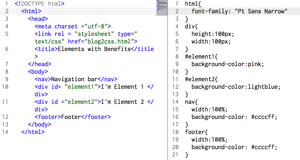
I wrote some simple code so we have the basics of a webpage.
The code:
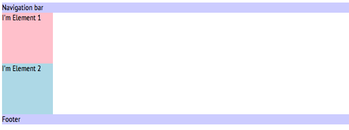
When we're done with it, Element 1 and Element 2 should be sitting right next to each other, chatting it up at the bar for a late night out. But right now, our elements don't even know each other. Element 2 is at a whole different table. Let's help them out.
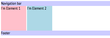
First we have to start by understanding why the elements lined up the way they did. If you check out the source code, you can see that we didn't exactly specify where the elements should be. All we have are size specifications (and some color, to make it pretty).
Currently, the elements are block style in normal flow. <Div> elements are, by HTML5 standards, block elements. Other elements, like <p> and <h1> elements, are also block elements by default. Some elements, like <span> and <img> elements are inline elements. These will behave differently, in that they will only take up as much space to the side as they have to. Let's see how things change if we make Element 1 a <span> element.
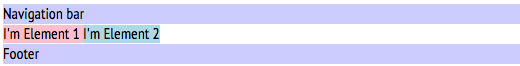
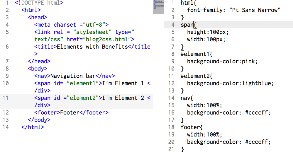
You can see that our elements now sit right next to each other! That's great, except we can't specify a height and width property. Our elements are only as big as they need to be. Since we're not trying to put our elements on a diet, maybe <span> isn't the best option for us. Our next question is, how do we keep the size of the elements that we want, and still have them hang out with each other?
Block elements in normal flow have a default:
position: static;
We can actually change this default value to something that's a little more useful to us. There are a few different positioning schemes that we can take advantage of:
- Relative
- Absolute
- Fixed
- Floating
I changed my elements back to <div> in the HTML, and put a <float> property into the CSS. Float positioning allows us to move an element as far in it's container element as we can. So when the code looks like this:
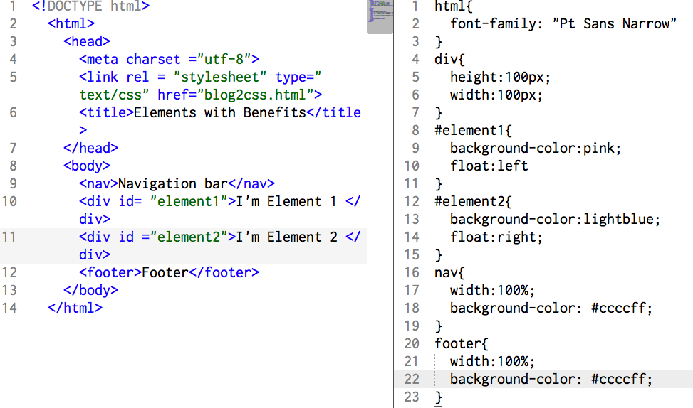
Our elements will look like this:
So what happened here? According to our code, all of our elements (including the navigation bar and the footer) sit inside our main body container. Since we didn't change either of their positioning properties, they're still sitting in normal flow. Element 1 and 2, however, are now sitting at opposite corners of the bar. That's because the floated all the way to the left, and all the way to the right. That's not quite what we wanted.
So what if we floated Element 1 and 2 to the left? Theoretically, Element 1 will stay where it is, but Element 2 will float as far to the left as possible, in relation to the other elements. Let's give it a shot:
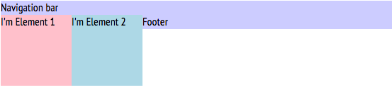
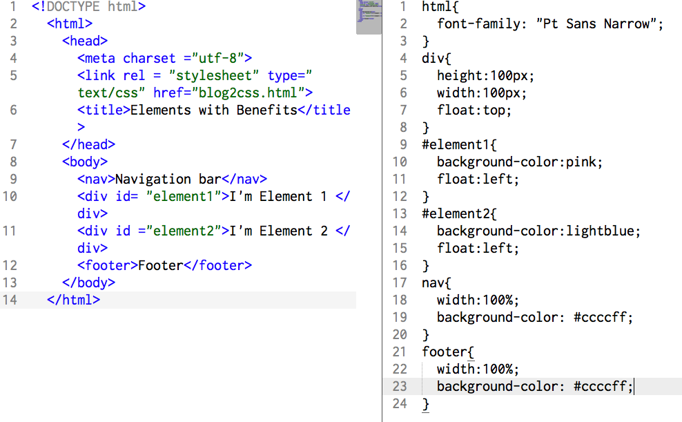
This looks great! Elements 1 and 2 are finally next to each other. That pesky footer, though, is now the awkward third wheel. Let's get him outta there.
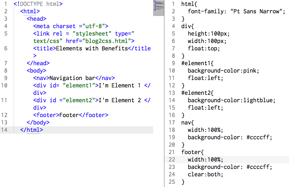
For that, we'll explore a concept called clear. Clear allows us to give an element some space from everybody else. If we clear an object's left side, no objects will sit on its left. If we clear an object's right side, no objects will sit on the right. We can even clear both sides. Let's try that on the footer.
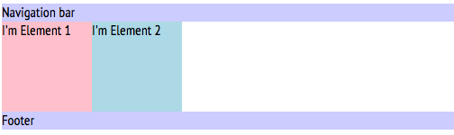
Wow! This is exactly what we wanted! We should be so proud. Except, it took so many commands and so many elements had to move around, that now it's 2 AM and the bar is closing and our elements didn't even have a chance to chat. Was there a way to do this quicker?
Of course! Now we can talk about the power of the inline block. Our elements are block elements, yes. But if we make them inline block elements, they'll sit horizontally next to each other instead of vertically! Let's give this a try. Make sure to delete all your float properties so you know it worked.
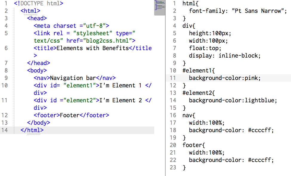
You can see that all we had to do was change one property for all our divs. Now our elements can hang together all night without the pesky disturbances of footer, and all we had to do was change how they displayed themselves. This is useful when you want to create anything from a multi-column article to a horizontal navigational menu. Inline blocks are powerful tools that aren't used nearly enough because float can get us the same results. However, I did promise you that'd we'd get our elements to lay next to each other nicely. One little property change is the nicest introduction any element can have.